An image my students will see next week
May. 12th, 2020 06:22 pmI updated my PowerPoint slideshow for the Politics and Economics chapter of my Environmental Science course with the following image, which illustrates the differences in unemployment by educational level over the past 30 years. It certainly does that, but it also shows how quickly unemployment in the U.S. jumped over the past two months. I could have used it to illustrate Unemployment hits 14.7% with experts predicting worse to come at Crazy Eddies Motie News. Next time.
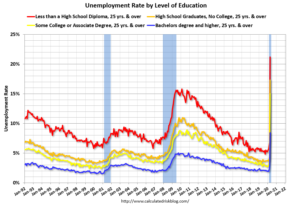
From Calculated Risk.
From Calculated Risk.